

[ Problem Space ]
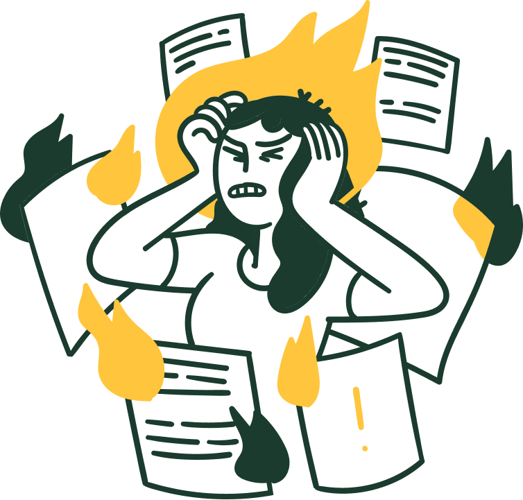
For many students, finding scholarships is overwhelming and time-consuming. Information is scattered across school websites, government portals, and third-party listings, leaving students to open multiple tabs and piece things together on their own. Even when opportunities exist, it's often unclear where to start or which ones are actually relevant.
We kept hearing this frustration come up in conversations with our peers. Many students shared stories of missed opportunities simply because they found scholarships too late. When we talked more openly about the problem it became clear this experience was widely shared across different programs and backgrounds.
What stood out was that the issue was not a lack of motivation or awareness. It was how difficult discovery felt in the first place.
[ The Challenge ]
How might we help post secondary students in Alberta discover and manage scholarships without the process feeling overwhelming or time consuming?
[ The Solution ]
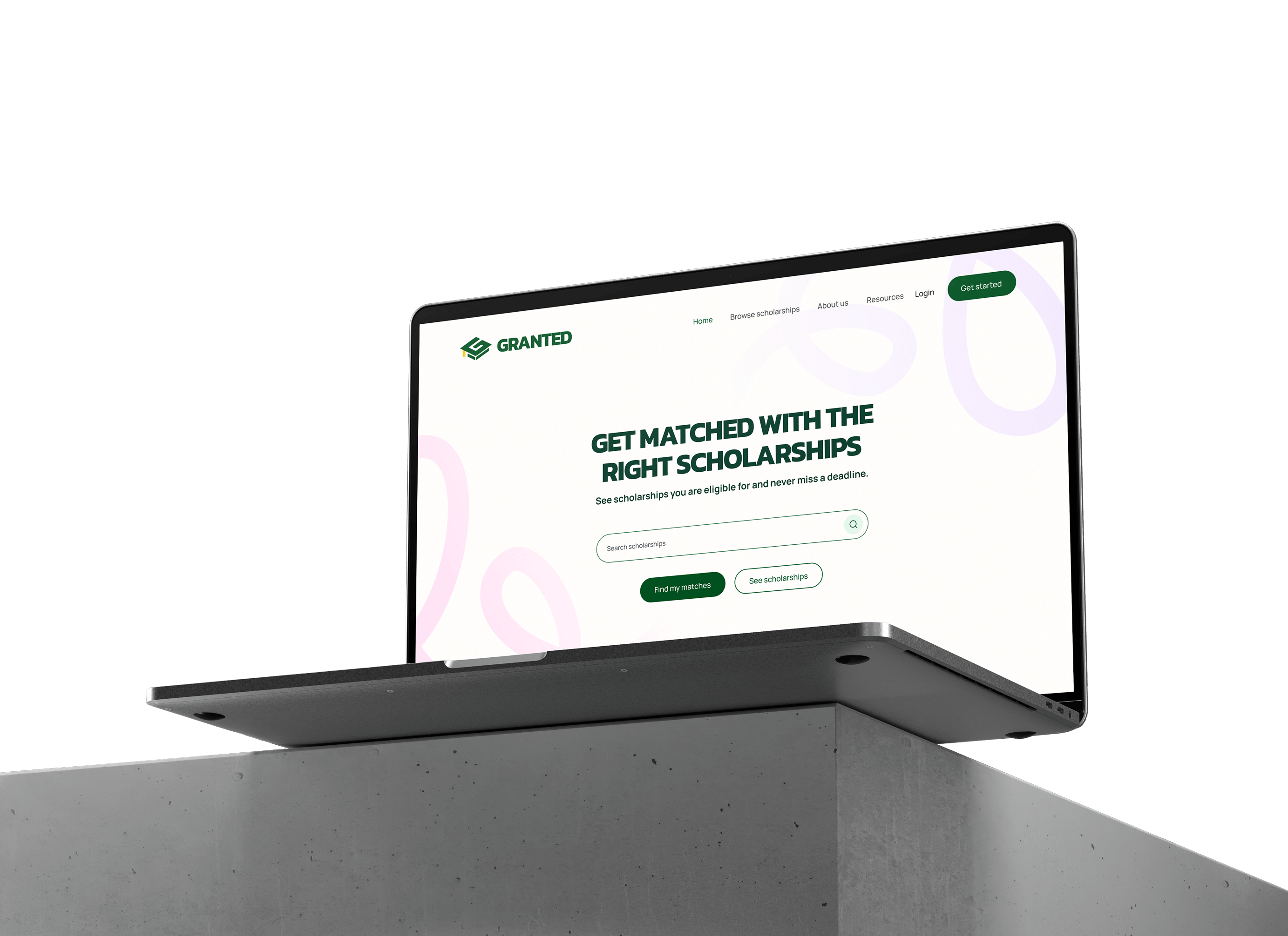
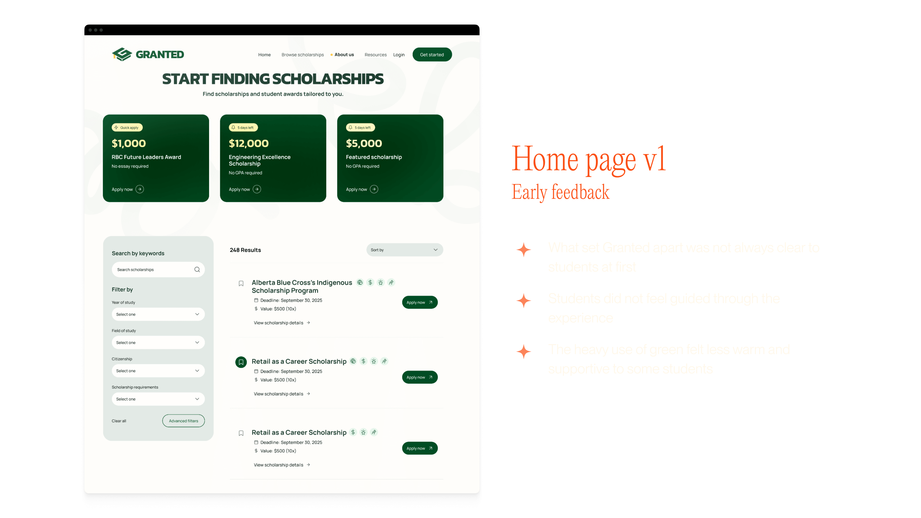
Making scholarship discovery easier with Granted
Granted brings scholarships for Alberta post-secondary students into one place. It helps students find relevant opportunities, stay organized, and avoid missing deadlines.
Matched scholarships
Students start by setting their preferences and goals. Based on this, Granted then shows scholarships that are relevant to them. By narrowing the search early, students spend less time filtering through options that do not apply and more time focusing on opportunities worth pursuing.
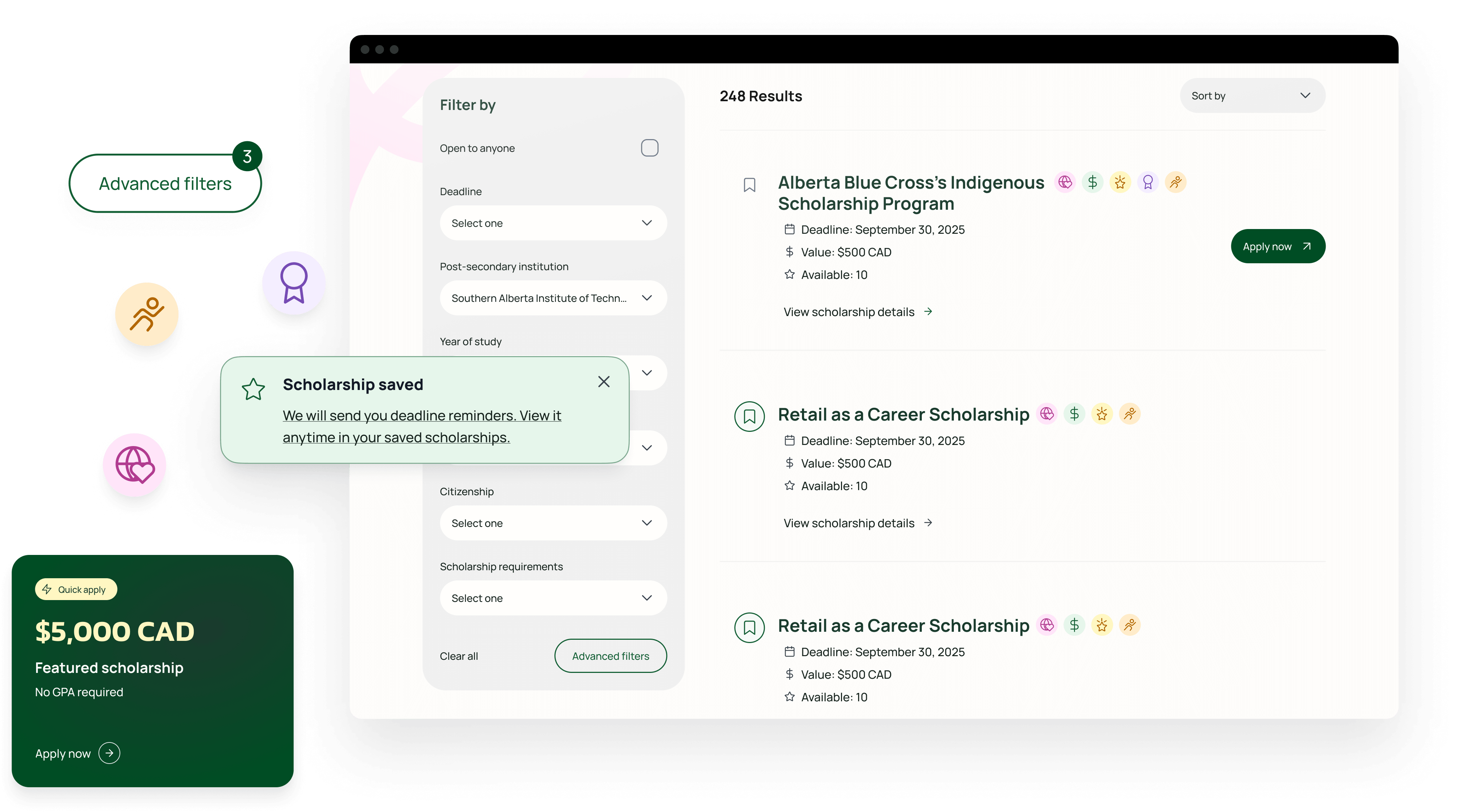
Saved scholarships
Students can save scholarships they are interested in and return to them at any time. This creates a simple place to keep track of opportunities without needing to search again. Once a scholarship is saved, students receive deadline reminders to help them stay on track.
Clear deadlines and timely updates
Missing deadlines was a common frustration shared by students. Granted keeps important dates visible and easy to track, helping students stay informed and apply on time without needing to constantly check multiple sources.
[ Research ]
Understanding the problem
We reviewed existing research and conducted interviews with Alberta post-secondary students to understand where the scholarship experience breaks down and why opportunities are often missed.
Missed funding
Even when funding is available, scholarships are often missed because they are hard to discover at the right time.
Fragmented sources
Scholarship information is spread across school websites, government portals, and third-party listings, making it difficult to find relevant opportunities efficiently.
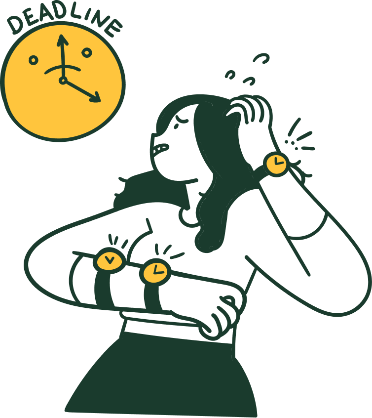
Hard to stay on track
Students often find it challenging to keep track of deadlines even after finding relevant opportunities.
[ Our hypothesis ]
If students can see relevant scholarships in one place and receive timely reminders, the process becomes easier to manage and fewer opportunities are missed.
[ Design ]
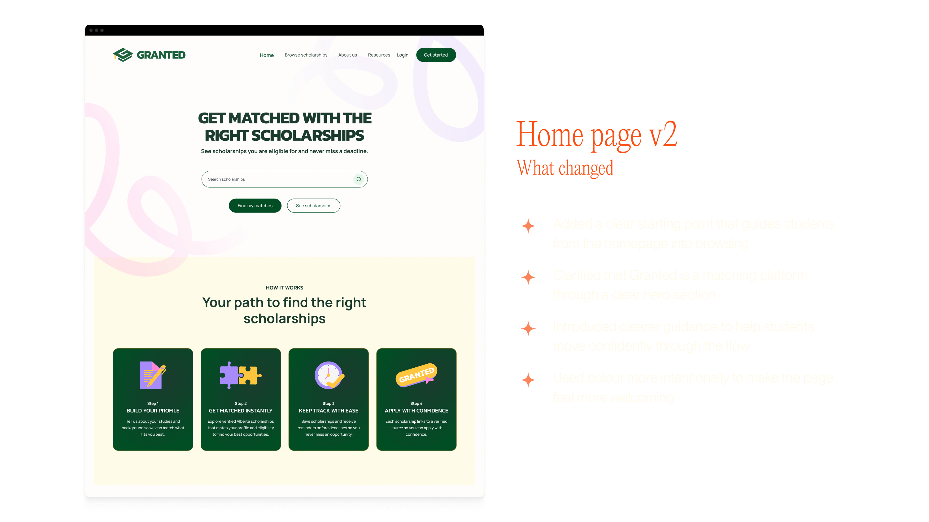
Design approach
We designed the experience around reducing the mental effort required to manage scholarships. Instead of trying to show everything at once, we focused on helping students understand what applies to them, when it matters, and what to do next.

Design focus
- Helping students find relevant scholarships efficiently
- Supporting students in keeping track of deadlines without added pressure
- Creating an experience that is easy to return to over time

Out of scope
- Replace financial aid offices or academic advising services
- Aggregate unverified or outdated scholarship listings
- Collect or store sensitive personal or financial information
Design explorations
While our graphic designers led the visual identity and brand guidelines, I began working on a usable design system for the product. I focused on how voice and tone showed up in the interface and how components and interactions stayed consistent and supportive for students.
[ Conclusion ]
What I learned
Design for the long haulScholarship search is not a one-time task. Students come back to it between classes, work, and deadlines. Designing with that reality in mind changed how we thought about pacing, clarity, and what really needed to be on screen.
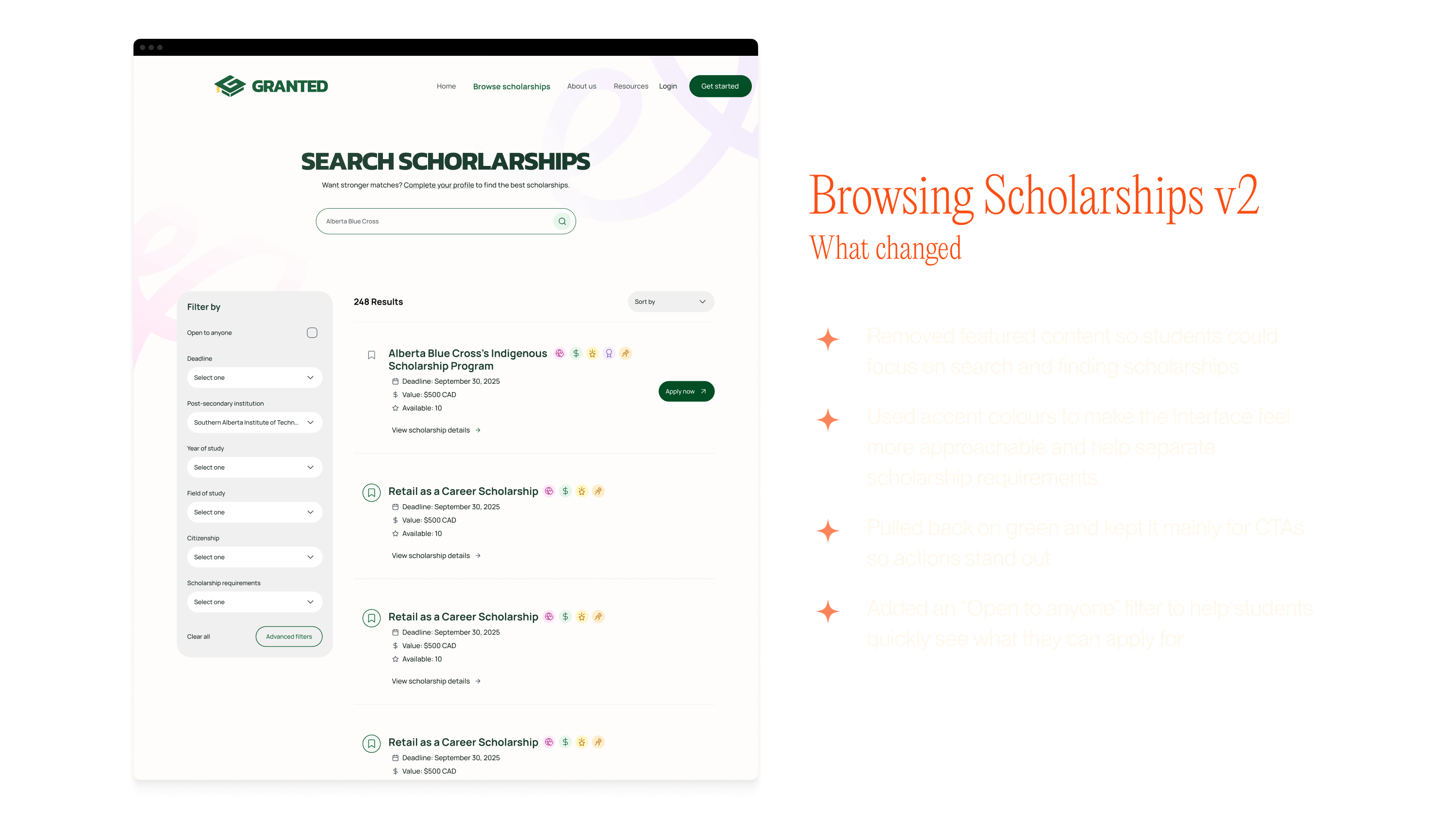
Less choice can feel more supportive Early on, it was tempting to show more information to be helpful. Over time, it became clear that reducing what students had to think about in any given moment made the experience feel calmer and easier to manage.
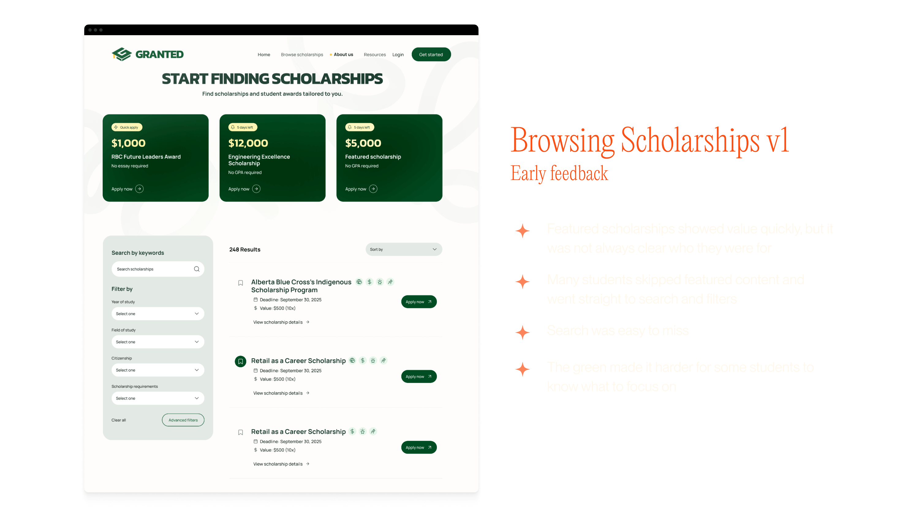
Visual restraint affects how the experience feelsStudents responded well to the all-green interface at first, but over time it began to feel repetitive and heavy. In the second iteration, introducing a small range of supporting colors helped create visual breathing room while allowing green to stay meaningful as a signal for calls to action.
Looking ahead
If I were to continue this project, I would:
- Further refine and document the design system to improve consistency
- Run another round of feedback focused on long-term use, not just first-time discovery
- Explore ways Granted could continue supporting students throughout their academic journey
This project doesn't end here. More to come as part of our capstone.